Graphic Design Case Study
NOOSA SOURDOUGH
The brief
We were asked to develop a brand for Noosa Sourdough Company that produces dehydrated sourdough starter enabling anyone to make artisan style sourdough bread at home. It was to have a natural look and sustainability was a key consideration when it came to designing the packaging.
Details
June, 2020
Categories
Brand Identity
Business Cards
Instruction Cards
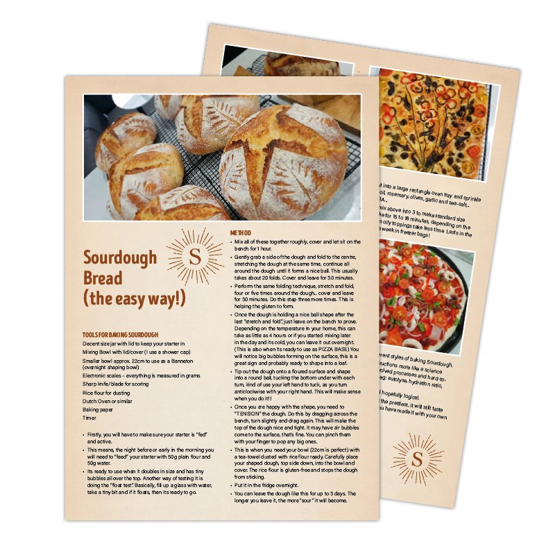
Ebook
Packaging
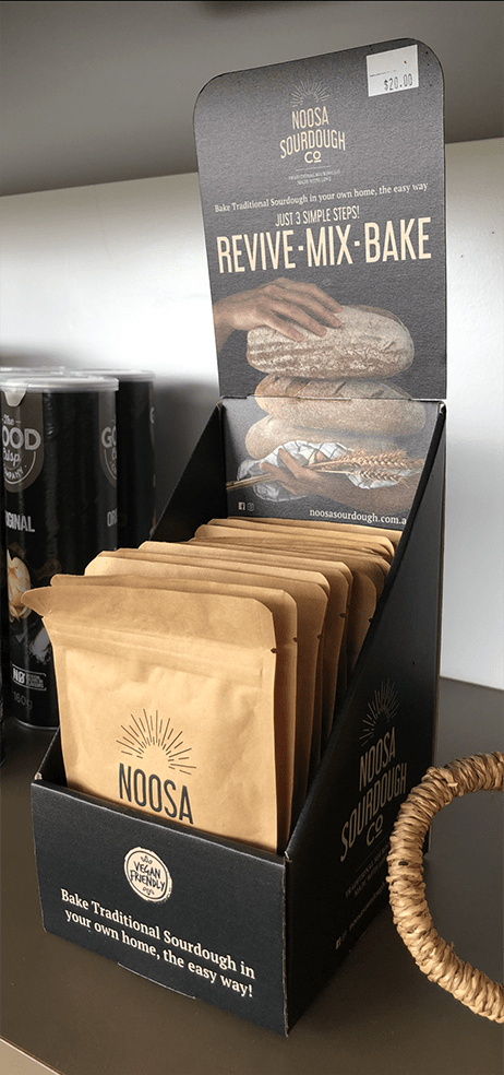
Display Box
Website
Email Automation
Objective
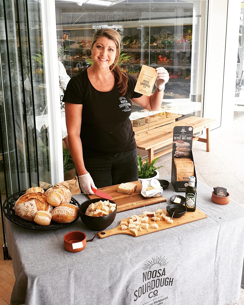
To create a visual identity that communicates the message that anyone can make artisan style sourdough at home with basic kitchen tools and ingredients that you would already have in the pantry.
Target audiences
Home bread bakers
Sourdough bread lovers
Look and feel
The design was to look simple, natural and uncomplicated. A sun burst was to be incorporated into the logo to convey warmth and happiness that sourdough brings with eating it and the love that goes into making it and sharing it with friends.
The approach
Firstly, we looked at images of sourdough to get an idea of the colours and shapes that are indicative to sourdough bread baking. Also the steps involved in making the starter through to the baking. These visuals were turned into a mood board to present to the client to show the design direction we were thinking of taking.
Design process
A number of design concepts were explored to represent the natural ingredients of bread and the loving process of making sourdough bread by hand.
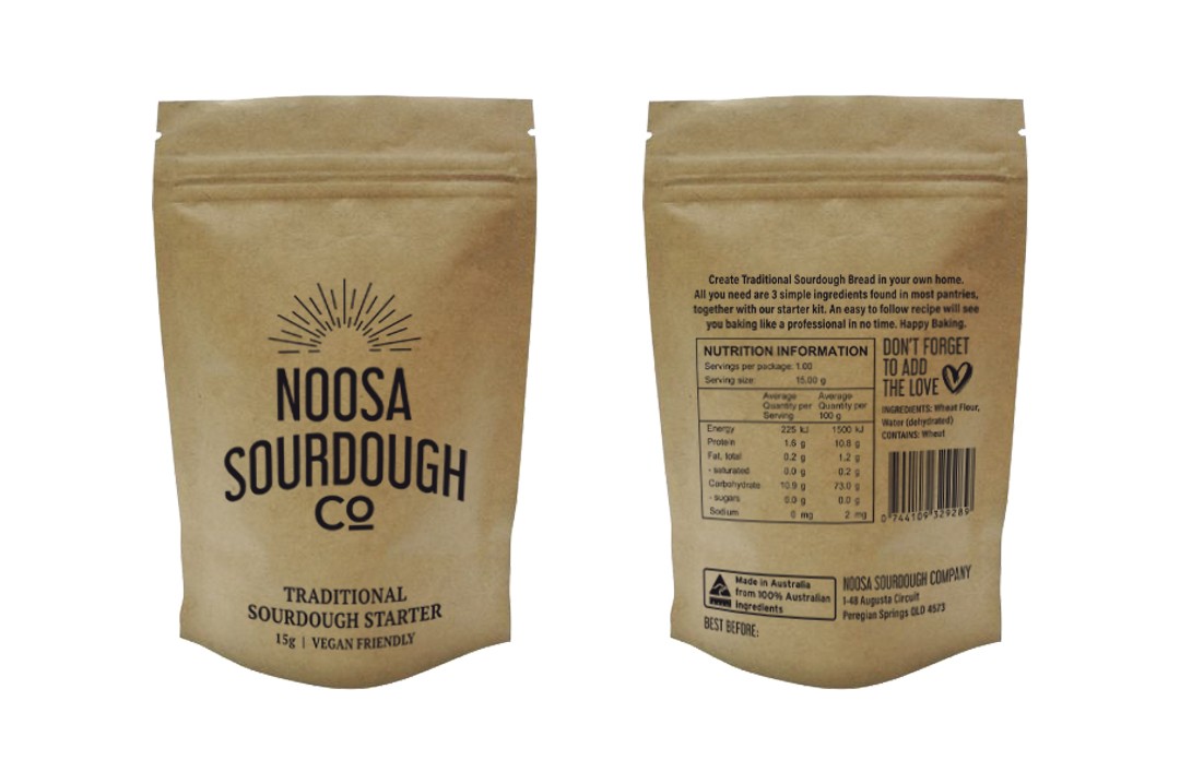
A Dutch oven is the best way to bake the sourdough bread and the outside of the traditional pots are black. This became one of the key colours for the branding.
The sourdough starter has a light creamy colour which was used to contrast the black.
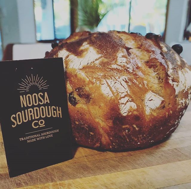
Kraft cardstock is popular for crafty projects and naturally suited the aesthetic we were going for with the business card printing.
A ready-to-go display box was found that could hold twenty pouches. The box was designed to be eye-catching and easy to understand from a customers perspective.
Typeface
Libel Suit a sans serif typeface was chosen for its tall and narrow characteristics that are similar to a loaf of sourdough bread.
Colour palette
A simple colour palette of black and light cream were chosen.
Deliverables
From the branding the team developed the following materials:
- Business Cards
- Instruction Cards
- Ebook
- Packaging
- Display Box
- Website
- Email Automation
The results
The logo concept below was chosen because it expressed the rising nature of sourdough bread.
Everyday all over the world bread is consumed as part of a meal with family. The sun motif captures this daily ritual.
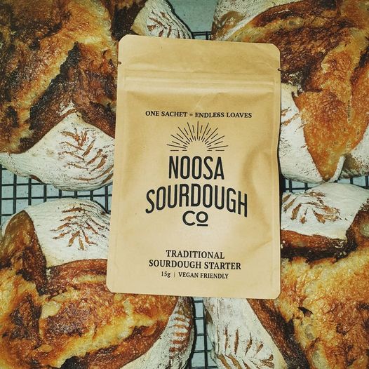
From our green packaging supplier we were able to source degradable pouches for the dehydrated starter to go in, fulfilling both the sustainable and natural aesthetic of the brief.
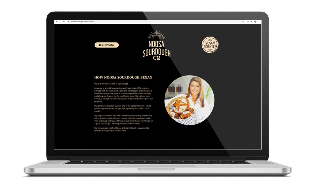
A website was built for Noosa Sourdough Co. to use as a contact page, a FAQ’s port and initially setup to connect through to an eBay store, with the infrastructure to upgrade a fully enabled WooCommerce online store.
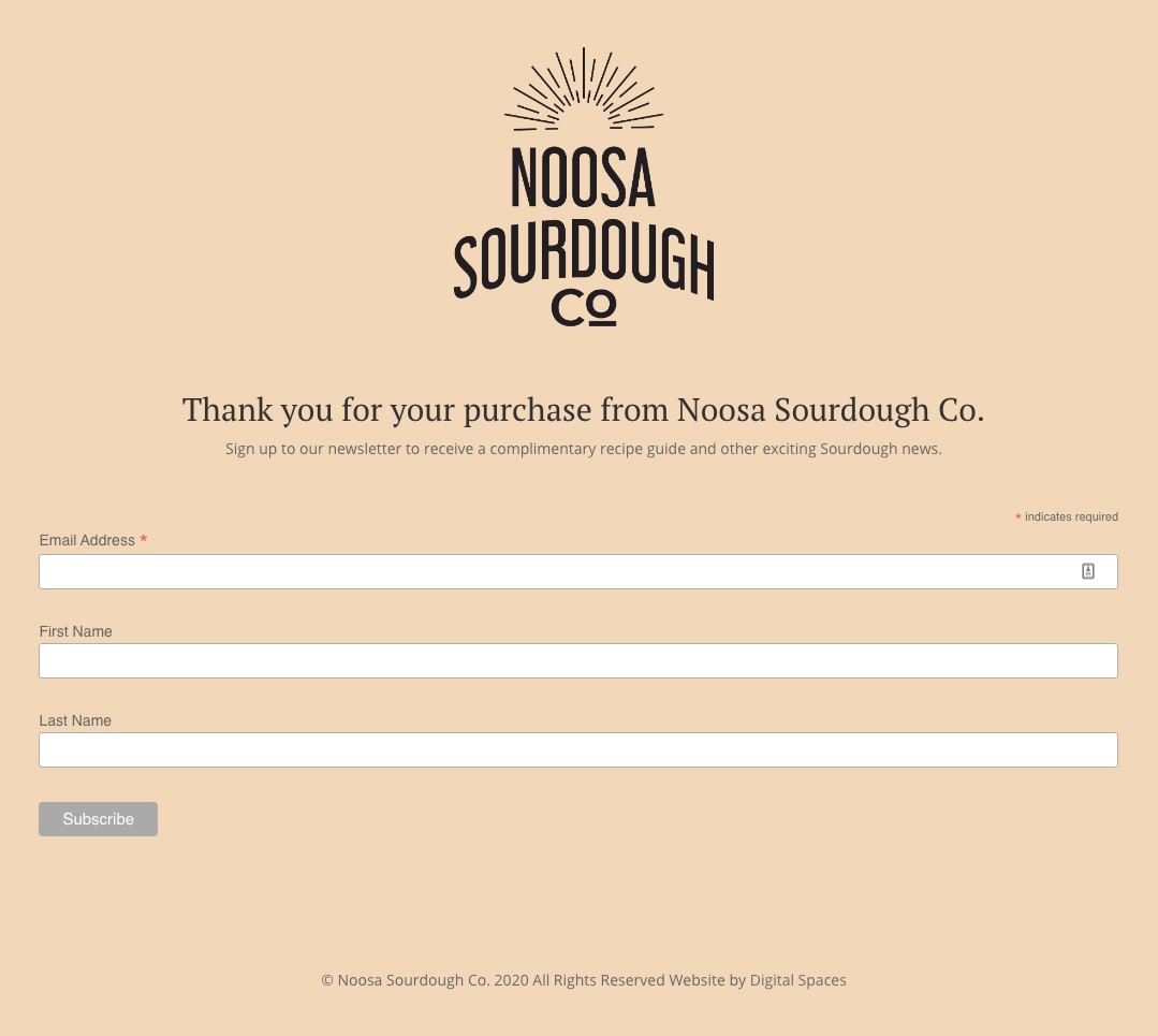
From the website we integrated a sign-up form that sends the Sourdough E-book to all her new customers when they purchase the dehydrated starter pack. Customers are automatically added to an email list that runs an automated email campaign.
Design Central
A full service Creative Design agency based in Queensland, Australia.
Our client base ranges from local start ups and established businesses, through to Government agencies, manufacturing companies and industry.
All have come to count on our agency for smart, cost-effective marketing solutions for their design and advertising needs.
CONTACT
(07) 54499972
hello@designcentral.net.au
Suite 2/199 Gympie Tce, Noosaville QLD 4566

