Graphic Design Case Study
GO NOOSA
Objective
To create a visual identity to link together all elements of the traffic management plan and encourage people to use sustainable transport options.
Details
November, 2018
Noosa Council
Categories
Brand Name Development
Brand Identity
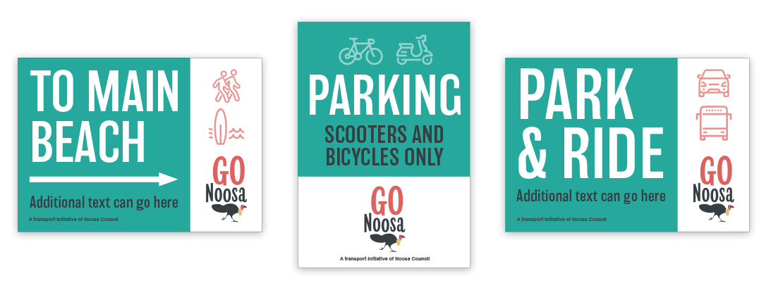
Wayfinding Signage
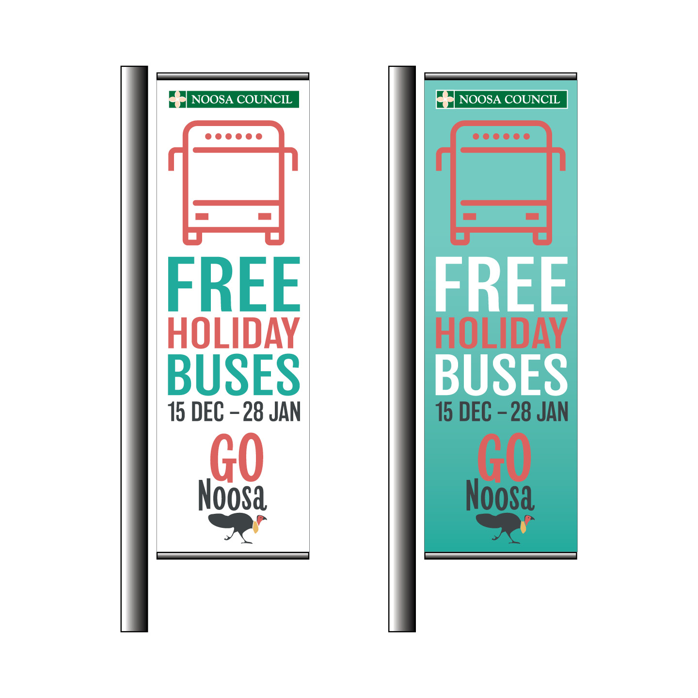
Outdoor Advertising
Project overview
The Peak Period Traffic Management Plan aims to address traffic and congestion during holiday periods including Christmas, Easter and July and September Queensland school holidays. The plan includes the following elements:
- Free buses
- Park & Ride
- Signs alerting people to car parking availability in the Hastings St precinct
- Traffic control in the Hastings St precinct to give way for buses and pedestrians
- Wayfinding signage at Noosa Heads bus stop
- Temporary replacement of parallel parking in Hastings St with scooter and bicycle parking
- RideShare carpooling App for Hastings St employees
- Paid parking at the Noosa Heads Lions Park
- Volunteers at key bus stops assisting visitors with directions
Look and feel
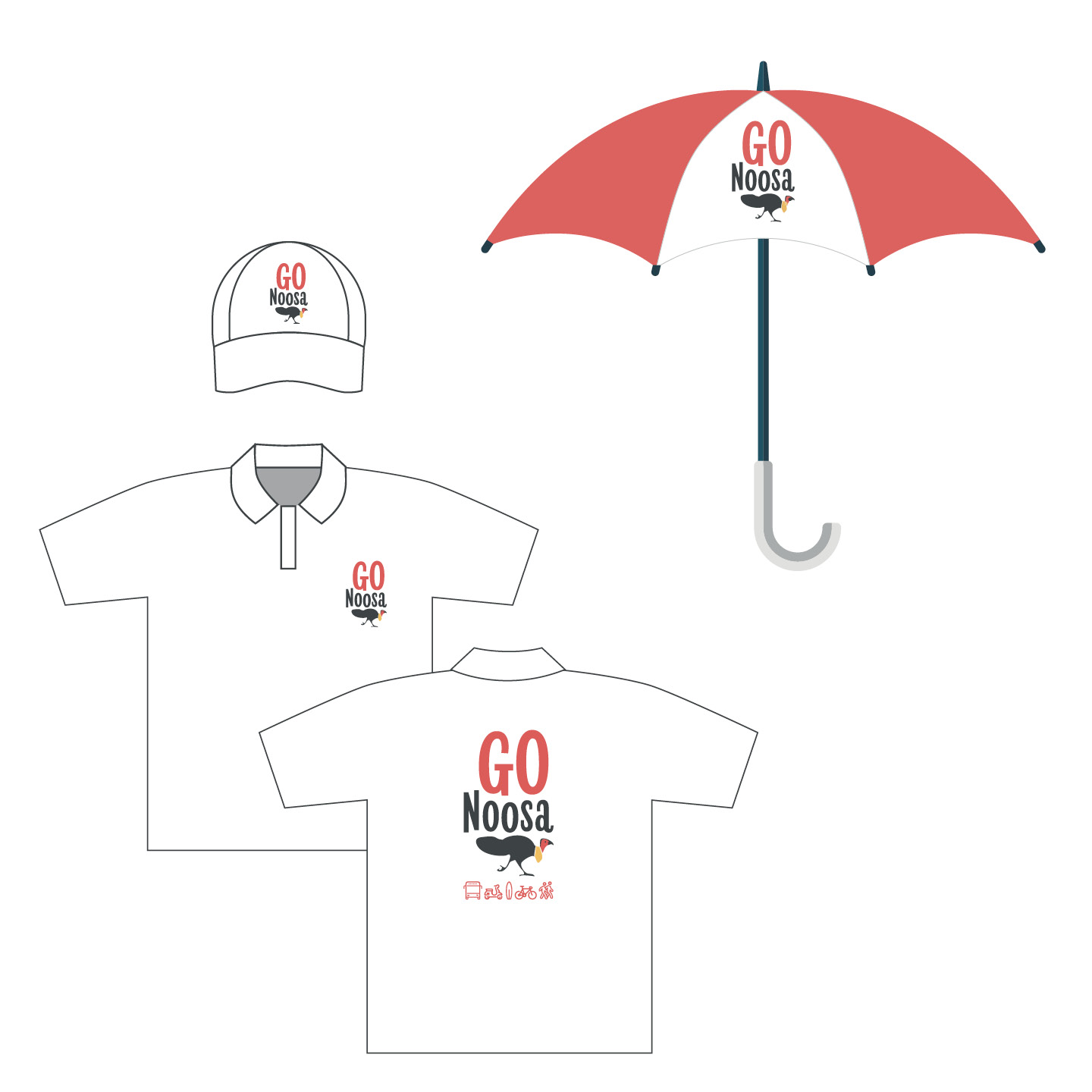
The design was to be generic enough to use across all peak holiday periods, and have a fun, relaxed Noosa holiday vibe, while also identifying as a Noosa Council initiative. It also needed to incorporate a sustainable transport (bicycle, bus, carpool, walk) look and feel.
The approach
Our initial thoughts on the project was that the Peak Period Traffic Management plan was very formal and would not present well to the target audience. A number of short and snappy names were proposed that encapsulated the plan in a user friendly approach.
Brand Name Development
The word Go is already a part of transport vernacular with the Go card being used for fast and convenient travel on public transport services. Being a verb, go evokes a sense of travel; moving from one place to another ‘Let’s go to Noosa’.
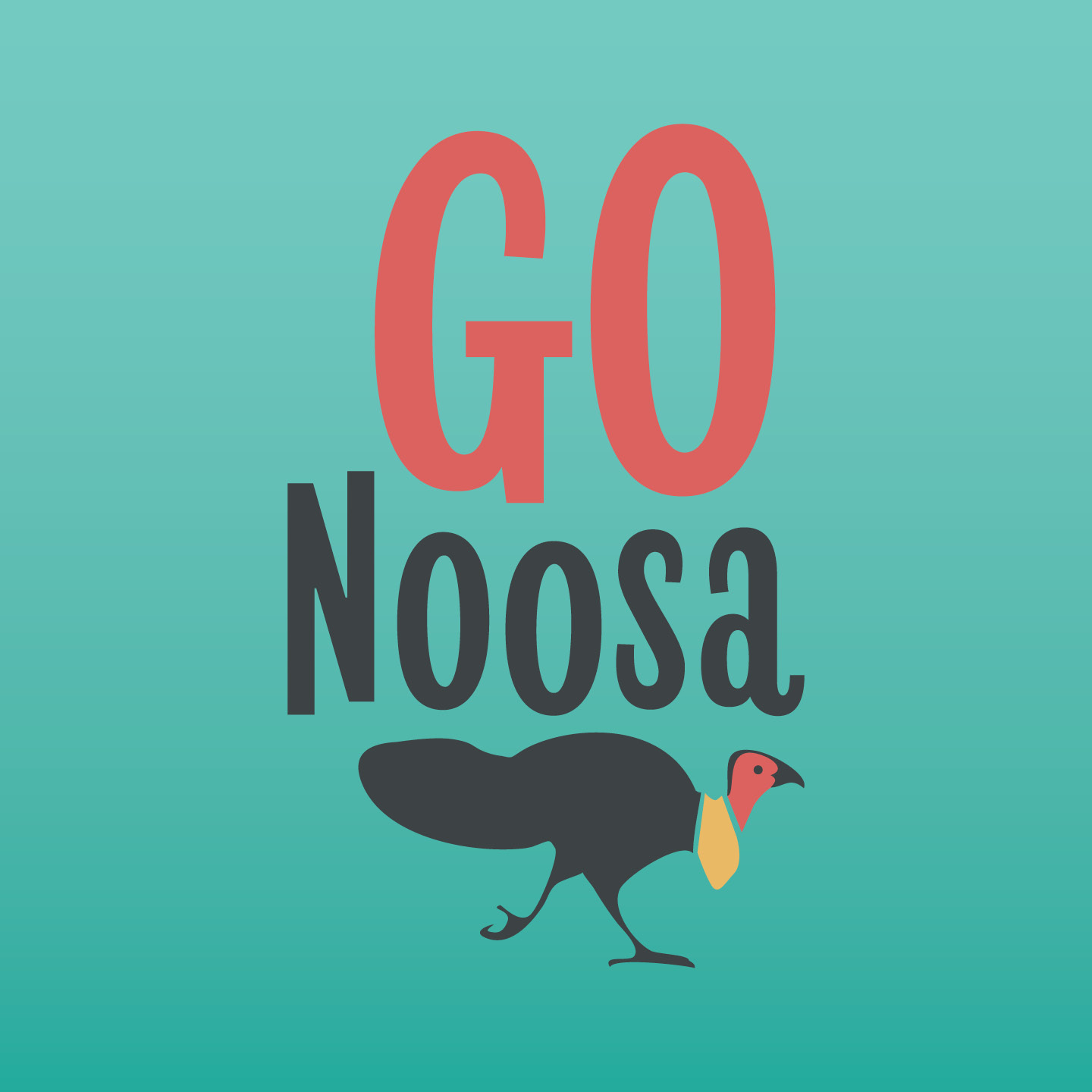
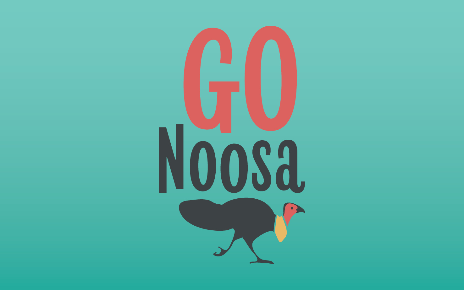
GO Noosa was chosen by Council as the new brand identity name.
Design process
A number of design concepts were explored to represent the traffic flow around Noosa. During the development process it became evident that the project needed an iconic representation to identify it as a Noosa traffic initiative. The native bush turkey are a common sight around Noosa and have even learnt to walk across zebra crossings to avoid being hit by traffic. So the quirky bush turkey became an ideal choice to serve as the GO Noosa mascot.
Typeface
A relaxed typeface was chosen to complement the ‘Trevor the turkey’ character. Revla sans is a display sans font with casual, rounded characteristics that help to convey movement and flow.
Colour palette
The primary colour palette red, yellow and dark grey came from the colouring of a bush turkey. The teal was chosen as a secondary colour to represent the beautiful waters of Noosa main beach which attracts visitors on holidays.
Transport icons
A range of transport icons were developed as supporting design elements to use on GO Noosa collaterals. These can be mixed and matched at the designer’s discretion according to the application. Transport icons can be used on signage as identifiers and to reinforce the message. The holiday icons (palm tree, surf board) can be added to the mix to maintain the holiday transport branding. The transport icons also aid in easily identifying the transport options within the GO Noosa app.
Design Central
A full service Creative Design agency based in Queensland, Australia.
Our client base ranges from local start ups and established businesses, through to Government agencies, manufacturing companies and industry.
All have come to count on our agency for smart, cost-effective marketing solutions for their design and advertising needs.
CONTACT
(07) 54499972
hello@designcentral.net.au
Suite 2/199 Gympie Tce, Noosaville QLD 4566

